TRACE is a critical design fiction, a fictional but entirely believable personal wellness platform that monitors your biometric and behavioral data in real time, your heart rate variability, your mood, your typing rhythm, and your voice sentiment. It translates them into clear, plain-language insight, encrypted and visible to you only. The project takes the form of a fully realized brand, which is an identity system, a landing page, a typographic advertising campaign, and physical packaging mockup for a wrist-worn sensor, all executed in the precise, premium visual language of Apple and Whoop. Crucially, TRACE is not a dystopia, it is a coherent, desirable product that people would genuinely want, and that is the point. The critique is carried by seduction rather than warning and the brand is so polished, so caring, so credible that you want it before you catch yourself asking what it means to be understood completely. The typographic campaign carries this furthest stripped of imagery, each advertisement leaves you alone with the product's voice, where reassurance and intimacy sit closer together than is comfortable. Drawing on my professional background in sales, the project deliberately deploys the real techniques of persuasion, which features into benefits, and anxiety into opportunity so that anyone with marketing literacy recognizes the seduction as it happens and feels the unease that follows. If TRACE feels like a product you could buy today, that is the argument and the culture that would happily embrace it is already here.
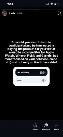
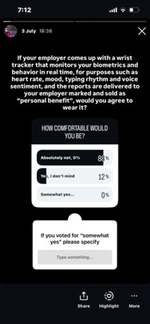
Before TRACE became a personal wellness device that tracks biometrics, it began as a subscription-based workplace wellness platform. The system monitored employees' biometric and behavioral data in real time, including heart rate variability, mood indicators (such as anxiety and stress), typing rhythm, and voice sentiment during meetings and delivered weekly "Wellbeing Intelligence Reports" to management. Although the product was sold to companies, it was presented to employees as a personal benefit. The surveillance aspect was never labelled as such; instead, it was framed as care. After pitching this concept as Milestone 1, my lecturer advised me to consider the perspective of the customers/consumers and reflect on how I would feel if required to wear the product. In response, I conducted a brief survey with my peers to gauge their reactions to the idea of using it. The responses were as below:
Peer survey responses to the original workplace wellness concept.
That's when the idea shifted to what TRACE currently is today.
Entry 1 · Week 1 — Concept
The Argument before the Artifact
TRACE is a critical design fiction: a fictional yet entirely plausible personal wellness platform that monitors biometric and behavioral data in real time, heart rate variability, mood, typing rhythm, and voice sentiment and translates these signals into clear, plain-language insights that are encrypted and visible only to the user. The project takes the form of a fully realized brand, encompassing an identity system, a landing page, a typographic advertising campaign, and physical packaging mock-ups for a wrist-worn sensor, all executed in the precise, premium visual language of brands such as Apple and Whoop.
Importantly, TRACE is not a dystopia. It is a coherent, desirable product that people would genuinely want and that is precisely the point. The critique operates through seduction rather than warning. The brand is so polished, so caring, and so credible that the viewer wants it before pausing to question what it means to be understood completely.
Drawing on my professional background in sales, the project deliberately employs real techniques of persuasion, turning features into benefits and anxiety into opportunity, so that anyone with marketing literacy recognizes the seduction as it unfolds and feels the unease that follows. If TRACE feels like a product one could buy today, that is the argument; the culture that would readily embrace it already exists.
Entry 2 · Week 2 — Research
The Language of Premium Wellness
Before designing anything, I examined Whoop and Apple closely (who are my two inspirations), along with a lot of other range of wellness and fitness brands, and identified the recurring patterns across them:
Restraint as a trust signal.
Near-white space, a single accent color, and almost no decoration.
Minimalism.
Data rendered professionally, waveforms and scores are presented as aesthetic objects rather than raw numbers.
Second-person address, speaks to one individual, never an audience, and frames measurement as care.
Absence of the body.
That final pattern proved the most useful finding. If the category already replaces the person with their data, then a brand that does so completely is not a leap into fiction, it is simply one honest step further. This realization is what made the seduction strategy viable rather than merely clever.
Entry 3 · Week 2 and 3 — Identity
Pulse Mark and Wordmark
The mark went through several rounds before it was settled. The final form consists of five rounded bars of varying height with a single Olympian-blue center bar being the longest line: a heartbeat rendered as data, and an audio-waveform silhouette that also reads as a voice, which is an important resonance, since TRACE listens to voice sentiment. Building it from plain geometry rather than a drawn illustration ensured it would survive any reproduction, from favicon to embossed box.
The wordmark took longer and taught me more. My first attempt set Inter Light with soft blue gradients bleeding into the T and the C, clipped inside the letterforms so the color appeared to sit within the type. Reviewing it at small sizes, I abandoned that approach entirely. The accents muddied the letterforms and competed with the mark beside them. The blue had to mean one thing within the system; if it appeared in the mark, it should not also decorate the type.
A second issue only became apparent under close measurement. The trademark symbol looked visibly detached from the final E. Inspecting the rendered geometry revealed that the wordmark's tracking was adding trailing space after the last letter, so the gap I was seeing measured roughly nineteen units rather than the five I had specified. Correcting it required measuring the letterform's actual ink edge rather than its layout box.
Final primary lockup: the pulse mark with the Inter Light wordmark and trademark symbol, after the tracking correction.
The suite was then produced in the configurations a real brand needs: primary and reverse lockups, mark only, wordmark only, an app icon, and single color black and white versions for one color printing, embossing and embroidery.
Entry 4 · Week 3 — Color and Type
One Accent and the Rule for Using It
The palette was fixed at four values: near white (#F6F7F8), platinum (#9AA1A8), carbon (#0B0E12) and Olympian blue (#0C61DA). The governing rule matters more than the values themselves, blue is never decoration. It always signifies signal. It appears only on live data, on the pulse itself, and on a single call to action, and nowhere else. Enforcing this constraint made the interface feel instrument-like rather than styled.
To document the system I built a proportional usage bar showing roughly seventy per cent near-white, fifteen per cent carbon, ten per cent platinum and five per cent Olympian. Presenting the accent as a thin sliver communicates the discipline far more efficiently than a paragraph explaining it.
Typography employs two families. Inter carries the voice, light, large and human. Oswald annotates small, uppercase and letterspaced, like the markings on a measuring instrument. Establishing a clear hierarchy of display, wordmark, eyebrow, body and data label kept every subsequent artefact consistent without further decisions (Müller-Brockmann 1981).
The four-value palette with proportional usage bar, and the two-family typographic hierarchy.
Entry 5 · Week 4 — Landing Page
Making the Product that Ships
The landing page is a single continuous scroll comprising a hero with a live dashboard, a "How It Works" section, a movement-tracking section, a dedicated privacy section, a pricing table, and a footer carrying the legal copy. Rather than presenting the interface as a static mock-up, I built it as a fully working page, because motion is central to why the fiction feels real. The recovery ring fills, the mood bar animates into place, and the heart-rate line traces continuously.
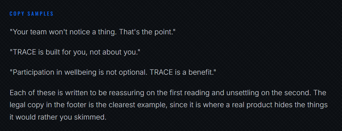
The copy is where my sales background did the work. Every line is written the way this category actually writes:
Landing page copy, written in the voice the category actually uses.
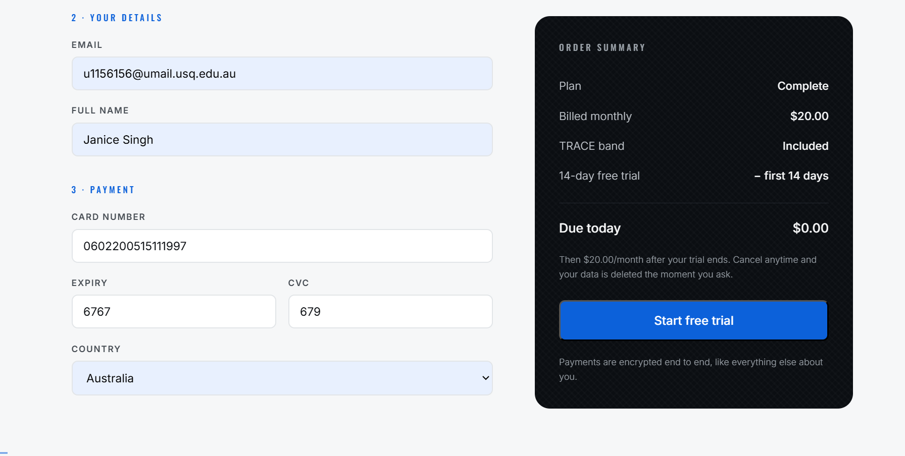
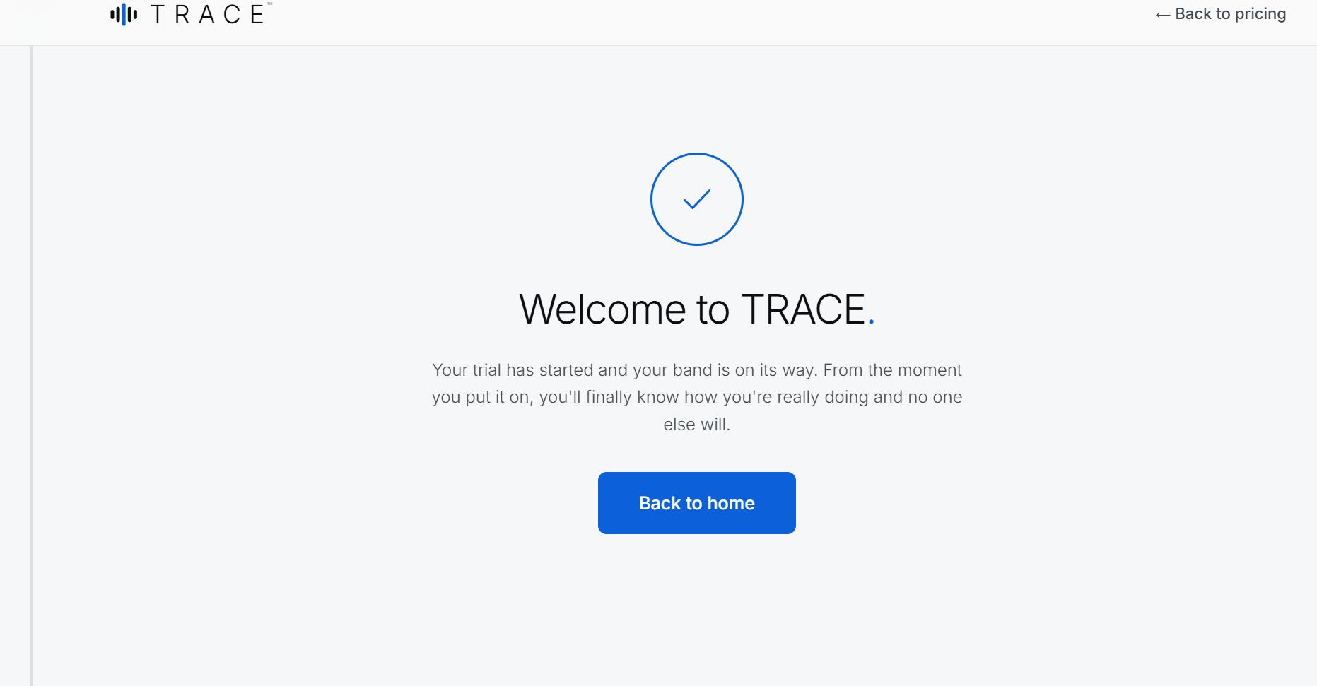
I also built a working checkout and a login with a private dashboard. The checkout itself makes the product feel purchasable rather than illustrated.
Working checkout, login, and private dashboard.
Entry 6 · Week 4 — Mentor Critique and Response
Minimal is not a Signature
The most useful intervention in the project came from feedback on the work in progress. The observation was that while the design was clean and minimal, minimalism alone does not distinguish a brand; there needed to be a clear rationale and a challenge that the design visibly overcomes. Three references were offered: the Spry interface, in which a translucent voice prompt sits over a workout and feels as though it accompanies the user; the Brooks redesign, which draws texture from maps and materials while advancing a timeline motif.
Reflecting on this, I agreed with the criticism. TRACE was coherent, yet its restraint read as generic premium and could have belonged to almost any wellness brand. What each of the referenced projects possessed was a distinctive device that carried the product's core idea. I responded with many changes, but with two major ones.
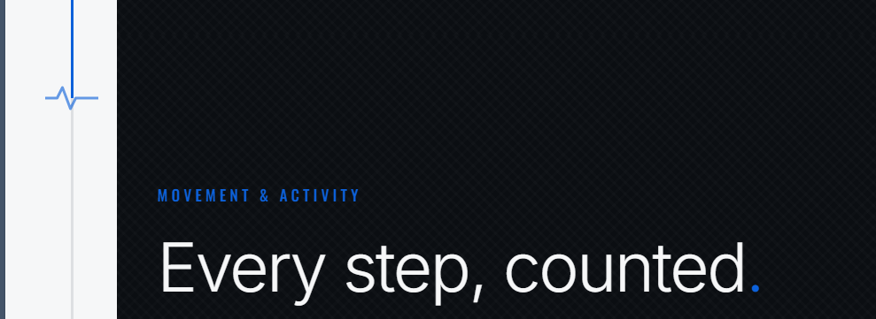
1. The pulse thread. A single thin signal line now runs down the full height of every page, drawing itself as you scroll, with a small ECG blip that beats gently at your position. It is the connective tissue of the whole site: continuous sensing rendered as one continuous line, always present and never loud. This gave me the rationale the feedback asked for. The challenge was to make continuous monitoring feel like calm care rather than clinical surveillance, and the answer was to let the signal itself become the brand's structure.
2. Woven texture. Following the Brooks logic of drawing texture from the product's own materials, I took the weave of the sensor's fabric strap and applied it as a near-subliminal crosshatch across every dark surface, at under two per cent opacity. You feel it more than you see it, and it ties the digital surfaces to the physical object.
The pulse thread and woven texture, added in response to the critique.
Entry 7 · Week 4 — Packaging
The Box It Arrives In
Until this point TRACE existed only on screen, and a product that never leaves the browser is easy to dismiss as a mock-up. The packaging was the moment the fiction had to become an object. If someone could imagine holding the box, the product stopped being a concept and started being something you could have bought.
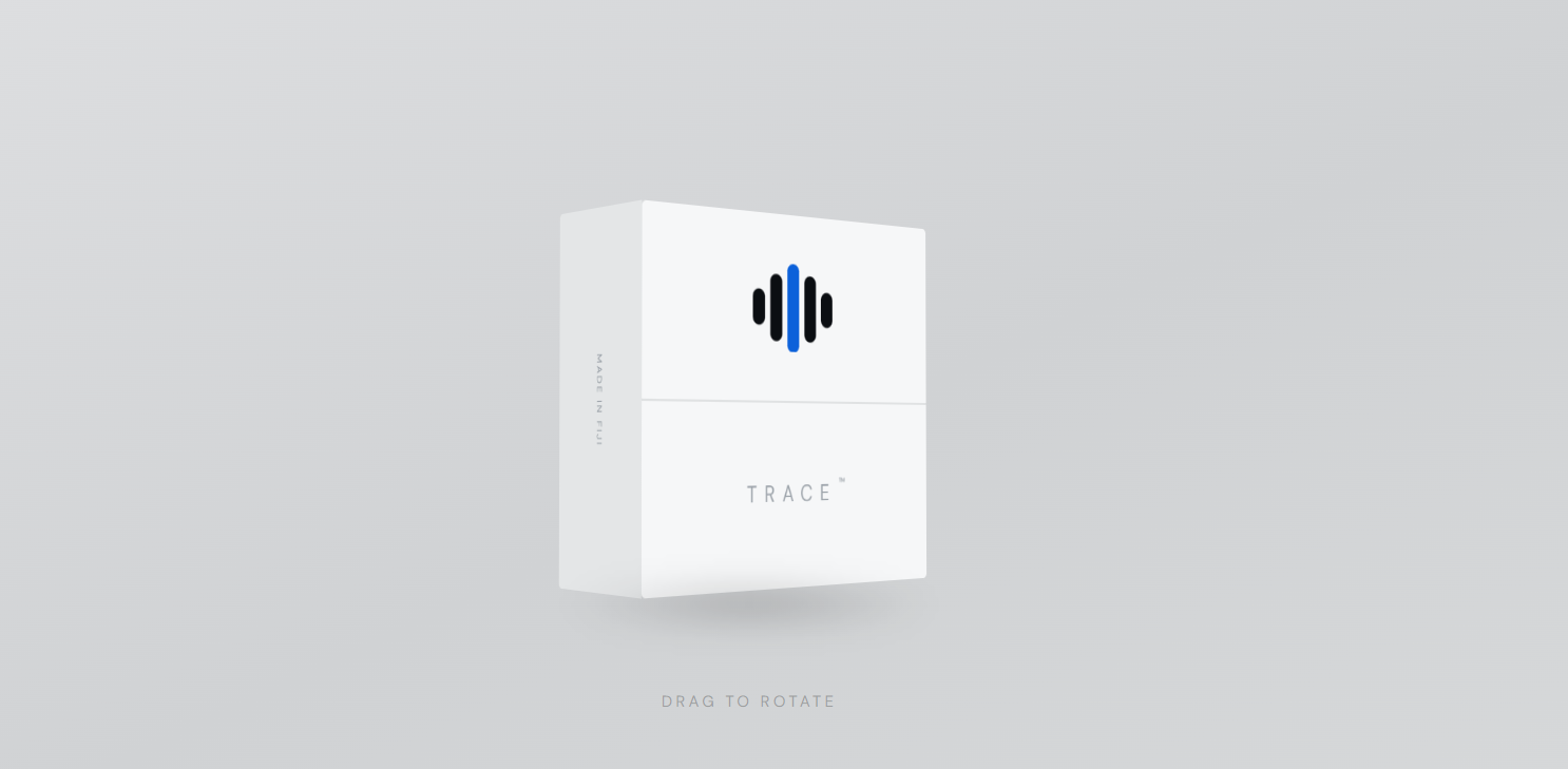
I built the box as an interactive 3D mock-up rather than a flat render, so it can be rotated and inspected from any angle. That decision came from the same reasoning as the working landing page: a still image asks you to believe it exists, while something you can turn over in your hands makes the question redundant.
The surface design follows the restraint established in the identity system. The pulse mark sits alone on the lid, with the single Olympian-blue centre bar carrying the only colour on the entire package, exactly as the palette rule requires. The wordmark and trademark symbol sit below the fold line, set small and letterspaced. Everything else is left empty. A premium wellness product signals confidence by how little it needs to say, and the blank white face does more persuasive work than any claim printed across it would.
Producing it also tested the identity suite in the way it was designed to be tested. The single-colour and embossing-ready versions of the mark, prepared back in Entry 3, were exactly what this surface required, which confirmed that building the mark from plain geometry rather than illustration had been the right call.
The physical packaging mock-up, built in 3D so it can be rotated and examined.
Entry 8 · Week 5 — Testing and Interaction
Three Icon Systems
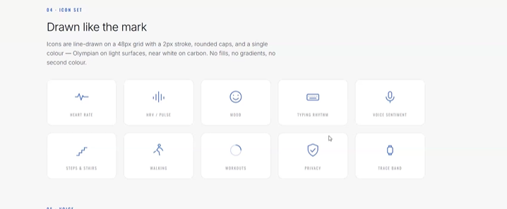
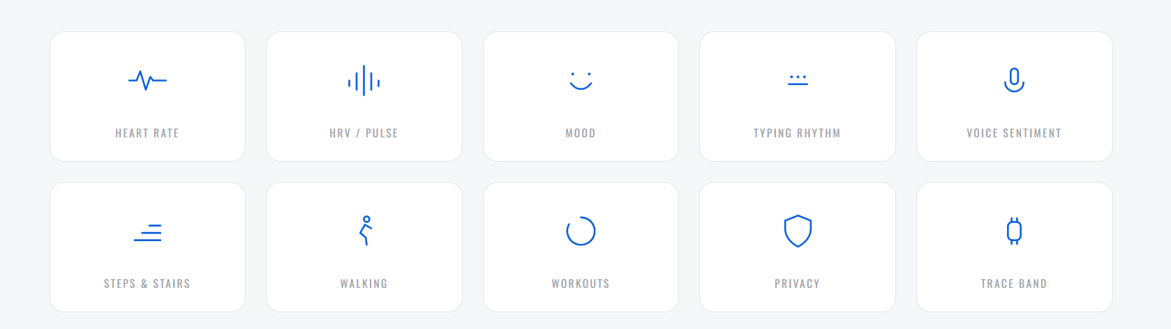
The first icon set was accurate but visually busy, with a detailed keyboard, a face with eyes, and a running figure carrying more line work than the rest of the system. Rather than redraw them by instinct I built a comparison page and designed the same ten concepts three different ways, so they could be judged as systems rather than individually:
Direction
Approach
Assessment
A. Reduced
Same concepts, minimum marks, lighter stroke
Safest and most legible
B. One gesture
Each icon drawn as a single unbroken line
Best conceptual fit, but several became abstract
C. Pulse-bar language
Built only from the logo's rounded bars
Strongest brand ownership, but icons blurred together
Seeing them together made the decision obvious in a way that describing them could not. Direction C was seductive on paper but failed the basic test of an icon set, which is that ten icons must be distinguishable at a glance. I adopted Direction A as the base and then simplified individual icons one at a time against it, reducing the keyboard to three dots over a rule, the stairs to three ascending strokes, and the microphone to a single capsule and arc. The face, heart rate, HRV and privacy icons were left alone because they were already at their minimum.
Before
After
Entry 9 · Week 6 — Campaign
The Typographic Campaign
The advertising campaign strips away imagery entirely, leaving the viewer alone with the product's voice. Removing photography was a deliberate decision rather than a purely stylistic one: with no model to look at, nothing stands between the reader and the sentence, and the intimacy of the copy has nowhere to hide.
The voice rules documented in the brand guidelines were written to make this approach repeatable. TRACE speaks quietly and with total certainty, in short sentences, without hype or exclamation marks. It never congratulates, scolds, or asks what it already knows. To make these rules usable, I wrote paired examples of what the brand says and what it never says, each pair rejecting a different failure mode: gym-brand hype, clinical alarm, goal-culture pressure, and defensive over-promising.
The typographic campaign, stripped of imagery. Four executions, each left alone with the product's voice.
Entry 10 · Week 7 — Social
Where the Brand Actually Lives
A wellness brand without a social presence is not a brand, it is a website. Every company TRACE is modelled on reaches its audience through the feed long before anyone visits the homepage, so leaving that gap open would have been the one detail that gave the fiction away. Setting up the account was less about marketing and more about closing the last hole in the argument.
I built the profile as @traceyouunderstood, carrying the domain through as the handle so the two read as one thing. The bio is the wordmark and nothing else. There is no tagline, no list of features, no emoji stack, only the name and the link. Restraint that would look empty on most accounts reads as confidence here, and it is consistent with the voice rules: TRACE never explains itself more than it has to.
The profile photo tested the identity system harder than anything else in the project. A social avatar is a small circle displayed at roughly forty pixels in a feed, cropped and often against a dark interface. The pulse mark survived it intact, and the single blue centre bar is still legible at that size. Building the mark from five plain geometric bars rather than a drawn illustration, decided back in Entry 3, is the only reason it holds up there.
Working in the platform's dark interface also confirmed the reverse lockup was worth producing. The mark sits on near-black in the avatar and on near-white everywhere else in the system, and both versions had already been prepared rather than improvised.
There is something appropriate about the account being the last piece. Social media is where wellness brands do their most intimate persuasion, speaking to one person at a time in a space they scroll through alone. It is the natural habitat of everything this project set out to examine, so it is fitting that TRACE ends up there looking entirely at home.
The @traceyouunderstood profile, with the pulse mark as the avatar and the site linked in the bio.
Collaboration
Contributions and Input
This is an individual project. All design, writing and production work is my own. The following records external input received during production, as required by the task sheet.
Feedback that minimalism alone is not a differentiator, with reference to Spry, Brooks and MoEngage. Directly produced the pulse thread and woven texture additions documented in Entry 06
Shadrach
Peer review
Review of the exported guidelines document, identifying pagination faults that my own measurements had missed
Final Reflection
What the Project Taught Me
The central risk of this project was that a critical design fiction can fail in two opposite directions. If it is too obviously a warning it becomes a poster and nobody has to reckon with it, and if it is too seductive it becomes an advertisement for the thing it set out to question. TRACE had to be genuinely desirable and quietly wrong at the same time and holding that tension was the hardest part of the work.
The clearest evidence that I was managing it badly came in the middle of production. At one point I rewrote the product as a sincerely private, confidential wellness platform in which the data really did belong to the user. The result was coherent and pleasant because a product that keeps all its promises makes no argument. Returning to the design fiction framing while keeping the product's internal logic intact was the decision that rescued the project. The brief calls for something almost indistinguishable from reality, and that only works if the product genuinely makes sense on its own terms. Coherence is not the opposite of critique; it is the delivery mechanism for it (Dunne & Raby 2013).
The most valuable feedback I received was that minimalism is not a signature. I had mistaken restraint for identity and produced something that was well executed but interchangeable with any number of wellness brands. The correction, which was to find a device that carries the product's core idea, produced the pulse thread and the woven texture, and both are now the elements I would point to first. That experience reframed how I read critique. The feedback was not asking for more decoration, it was asking what the design was arguing, and I could not answer that question at the time.
The production blog requirement also changed how I worked. Documenting the icon exploration forced me to build all three directions rather than defending my first instinct and seeing them side by side made an unsuitable option obvious that I might otherwise have talked myself into. Testing produced a better outcome than taste alone would have.
The most uncomfortable lesson was technical. In producing the print-ready guidelines I spent several rounds refining a layout against a page height I had assumed rather than measured, and every conclusion I reached during that period was wrong by a third. I was measuring diligently and confidently, and I was confidently wrong. What broke the loop was an independent probe that established ground truth, and before that, a peer sending me a screenshot of what the file actually looked like. The professional habit I want to carry out of this is to verify the instrument before trusting its readings, and to seek direct observation early rather than treating it as a last resort.
If I were to continue the project I would push the typographic campaign furthest, because it is where the concept is most concentrated and least protected by craft. I would also want to test TRACE on viewers who do not know it is fiction, since the only real proof of the argument is whether someone reaches the pricing table before they start to feel uneasy.